
Best Paint Colour Combinations for Room Walls (2026)
## Standing in front of a paint store's shade card with forty near-identical greens is its own kind of stress. Most people end up picking whatever the salesperson suggests, then regret it the moment the first coat dries under their room's actual lighting.
Standing in front of a paint store's shade card with forty near-identical greens is its own kind of stress. Most people end up picking whatever the salesperson suggests, then regret it the moment the first coat dries under their room's actual lighting. A little colour theory fixes that — and it's simpler than it looks.
Start With the 60-30-10 Rule
Interior designers lean on this ratio because it keeps a room balanced instead of chaotic. Sixty percent of the room — walls and the largest furniture pieces — carries your dominant colour. Thirty percent, usually upholstery, curtains or a rug, carries a secondary colour that complements it. The last ten percent is your accent: a cushion, an artwork frame, one feature wall.
Skip this ratio and rooms tend to feel either flat or busy. Once you've picked a dominant wall colour, the rest of the room mostly picks itself.
What's Trending for 2026
Pantone named "Cloud Dancer" its Color of the Year for 2026 — a balanced, billowy white designed to feel calming rather than stark. Asian Paints picked a shade closer to home for its own 2026 Colour of the Year: Moonlit Silk, a green blended with hints of yellow and white, aimed at bringing a sense of calm to Indian living spaces.
Both point the same direction — quieter, nature-leaning tones over the saturated jewel colours popular a few years back. That doesn't mean bold colour is off the table; it means pairing one confident shade with a calmer base works better than filling a whole room with intensity.
Room-by-Room Combinations
Living Room
Warm neutrals still do the heaviest lifting here, since living rooms need to feel welcoming to people who don't live there. Try a warm off-white or beige base with a terracotta or rust accent wall behind the sofa, and bring in olive or forest green through cushions and curtains.
For something cooler, pair soft sage walls with white trim, then add charcoal or navy through the upholstery.
Bedroom
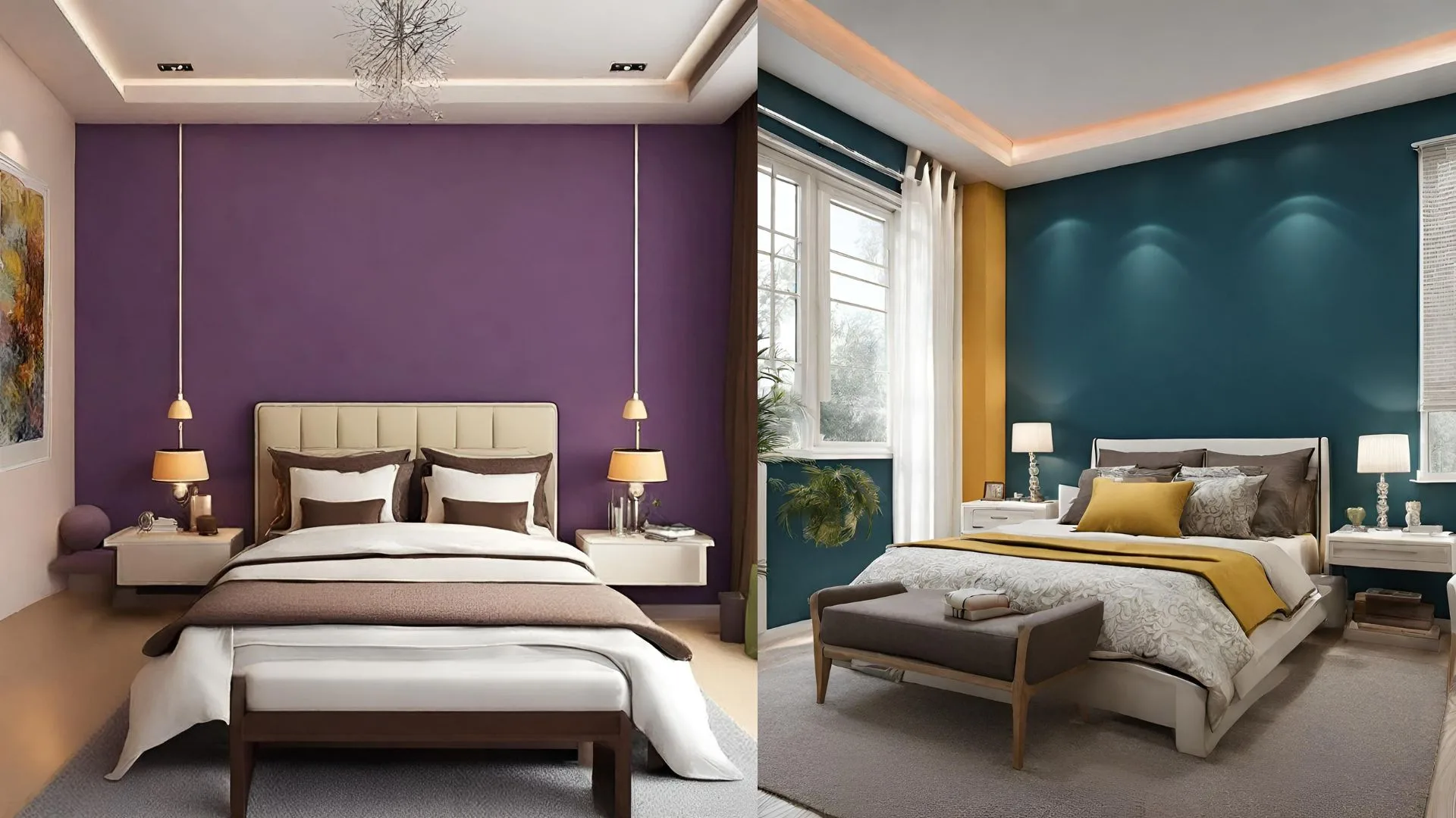
Bedrooms don't need to compete for attention, so muted, low-saturation colours work better than anything too bright. Dusty blue or soft sage walls with white or cream trim create a calm base. For more personality, put one deep colour — navy, forest green, or terracotta — on just the headboard wall, and keep the other three walls in a lighter neutral.
Skip high-gloss finishes in bedrooms; matte or eggshell reads softer under low evening light.
Kids' Room
This is the one room where brighter combinations genuinely work, since kids' spaces read as playful rather than chaotic even with more contrast. A soft yellow or mint base with white furniture leaves room to add bold colour through decals, bedding or a single accent wall — which matters, since kids change their colour preferences faster than most parents want to repaint.
Kitchen and Home Office
Kitchens benefit from colours that hide daily wear — warm greys, soft blues or muted sage handle grease and splash marks better than pure white. For a home office, colour affects focus more than people expect: soft blues and greens support calm concentration, while a warm neutral with one navy or forest-green accent wall keeps video calls looking intentional rather than bare.
Getting the Colour Right for Indian Homes
Colour reads differently depending on which way your room faces. North-facing rooms get cooler, indirect light, so warm colours — terracotta, mustard, warm beige — balance them out. South- and west-facing rooms get strong direct light for much of the day, so cooler tones like sage, soft blue or grey keep them from feeling overheated visually.
Humidity matters too, especially through the monsoon months. Washable, moisture-resistant emulsion finishes — most major Indian brands, including Asian Paints, Berger and Nerolac, sell one — hold up better in kitchens, bathrooms and coastal cities than a standard matte finish.
Before committing to a full wall, paint a sample patch at least 2ft by 2ft and check it at three different times: morning light, afternoon, and after dark under your actual bulbs. Swatch cards are lit under store lighting, which rarely matches home lighting.
Common Mistakes to Avoid Judging colour from a tiny swatch card. Colour intensifies across a full wall — a shade that looks soft on a 2-inch card can feel overwhelming across 120 square feet. Ignoring the ceiling and trim. A bold wall colour under a stark white ceiling can look disconnected; a slightly warmer or cooler white often ties the room together better. Skipping the undertone check. Two whites or two greys can look identical on the card and clash once painted — check for warm vs. cool undertones before finalizing two colours in the same space. Not testing under your own lighting. LED bulbs, warm-white bulbs and daylight all shift how a colour reads. Test before you commit to gallons.